Brand Identity Case Study For HC Designs
Programs Used | Adobe Illustrator, Adobe Photoshop.
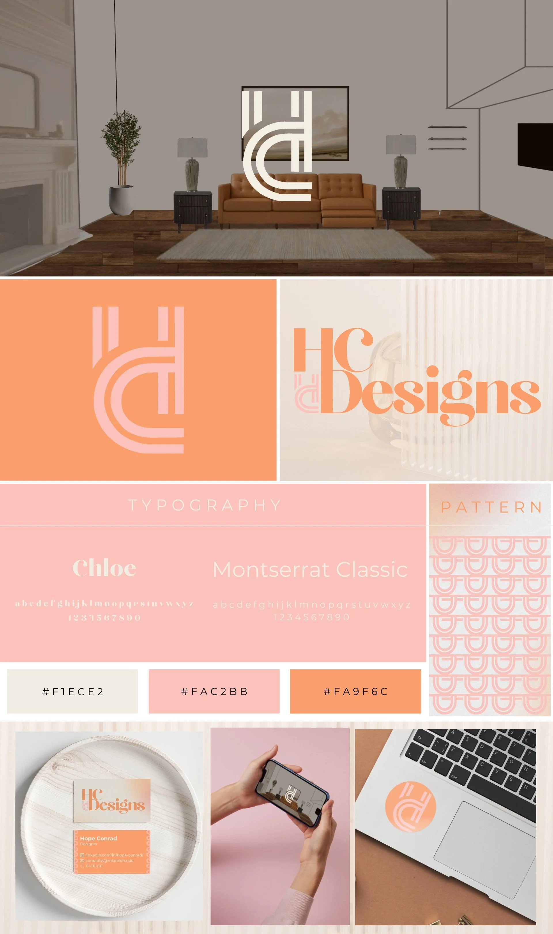
HC Designs is a modern and sophisticated online interior design concept brand with a strong visual identity that embodies elegance, creativity, and functionality. The branding package blends contemporary typography, a playful color palette, and a minimalist logo to create a cohesive and professional aesthetic while keeping creative nuances.
This case study explores identity goals, target audience distinction, the brand’s visual elements, design rationale, and potential applications.


Initial Findings
HC Designs positions itself as a stylish and innovative brand within the interior design space. The main goal going into the project was for its visual identity to reflect a balance between structure and fluidity, appealing to a clientele that values aesthetics and functionality.
Given this, the main target audience that the brand needs to appeal to is individuals looking to redesign their home in a functional, time-friendly way but are also ahead of trends, as they are choosing an online interior design route.
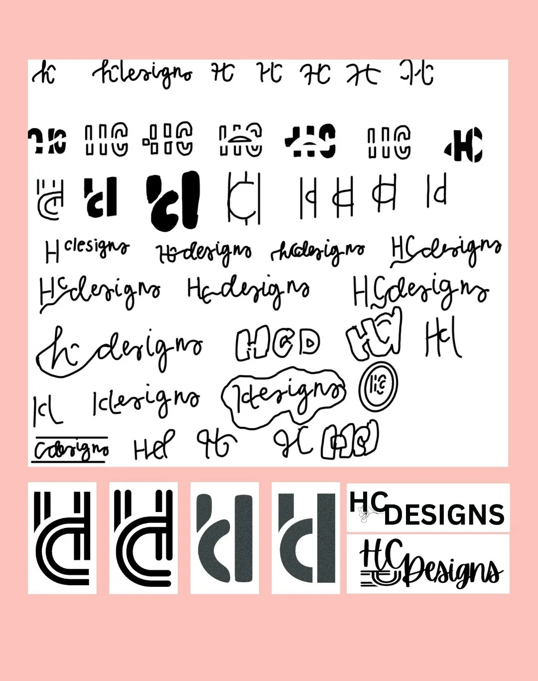
Logo Development & Iterations
The initial sketches of the brand logo highlight the beginning process of merging the main letters: “h,” “c,” and “d" to create a unique monogram to serve as the brand mark. Through the iterative process, it can be noted that many different versions of the brand mark were explored before choosing the final one.
Merging the distinct primary logo with the typography of the second logo also presented an exploratory challenge, which ended up coming together through the connection of the “h” with the “d.” The initial sketches were then utilized to build the final primary and secondary logos.
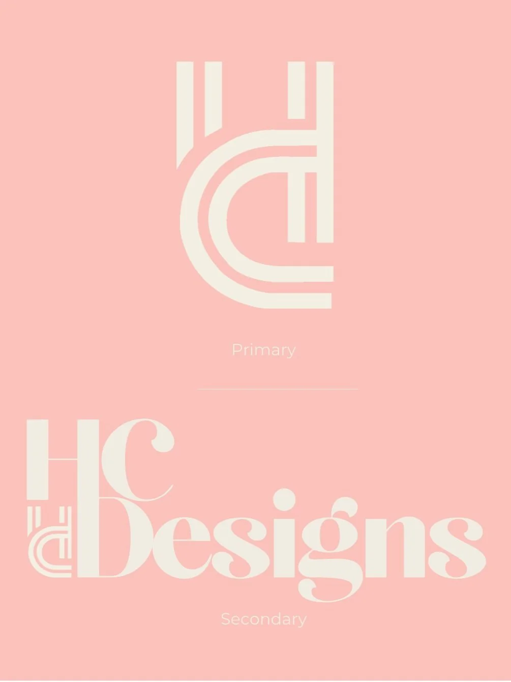
Logos
The HCD monogram logo is a bold yet elegant mark, designed with interlocking letterforms that create a strong visual identity. The use of clean, parallel lines in the "h" and "c" coming together to create a “d” gives it a structured and modern feel while maintaining readability.
It is meant to be a versatile logo that can be paired alone or with text, as seen with the secondary logo. The secondary logo is also distinct through the connection of the “h” and “d,” done purposefully so that the audience feels every element of the brand is connected. The main driving factor for the logo choices was that they were minimalist but distinct, allowing them to speak for the brand.
Typography, Colors & Pattern
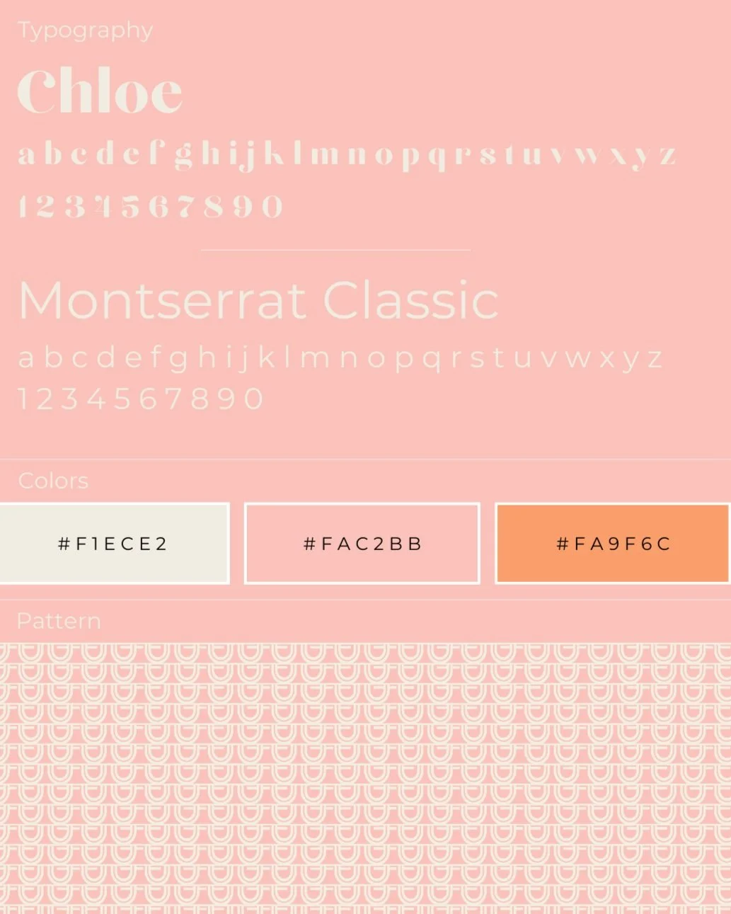
The brand package features two complementary fonts: Chloe, a soft, elegant serif font that adds personality and sophistication along with Montserrat Classic, a clean, modern sans-serif that enhances readability and professionalism. Chloe exudes high-end playful aesthetics, while Montserrat keeps the brand fresh and modern, coinciding to honor the creative roots of the brand.
HC Designs’ color scheme consists of soft, warm, and neutral tones, creating a welcoming and refined visual identity. #F1ECE2 (Cream) – A neutral, light beige that conveys sophistication and subtlety. #FAC2BB (Blush Pink) – A delicate, modern pastel pink that adds warmth and softness. #FA9F6C (Peach Orange) – A vibrant yet elegant shade that adds energy and contrast. The colors were specifically chosen to work well across different branding materials without overwhelming the design. Each of the colors can be layered on top of each other in different ways, allowing branding features to be versatile for many applications. Similar to a capsule wardrobe, the thought behind this is that it can be capsule branding, allowing for many pairings.
The pattern was developed through experimenting with logo application and is the “d” turned in various ways, then repeated, highlighting how design is the backing behind the brand.