Brand Redesign for lido del faro
Programs Used | Adobe Illustrator, Adobe Photoshop
Lido del Faro, translated as “lighthouse beach,” is a beloved Italian beach club known for its scenic coastline and tranquil ambiance. However, its original brand identity fell short of capturing the premium experience and emotional connection that guests associate with the destination. To address this, the goal was to modernize the brand and elevate its visual language to better reflect its coastal charm, timeless elegance, and Mediterranean warmth.
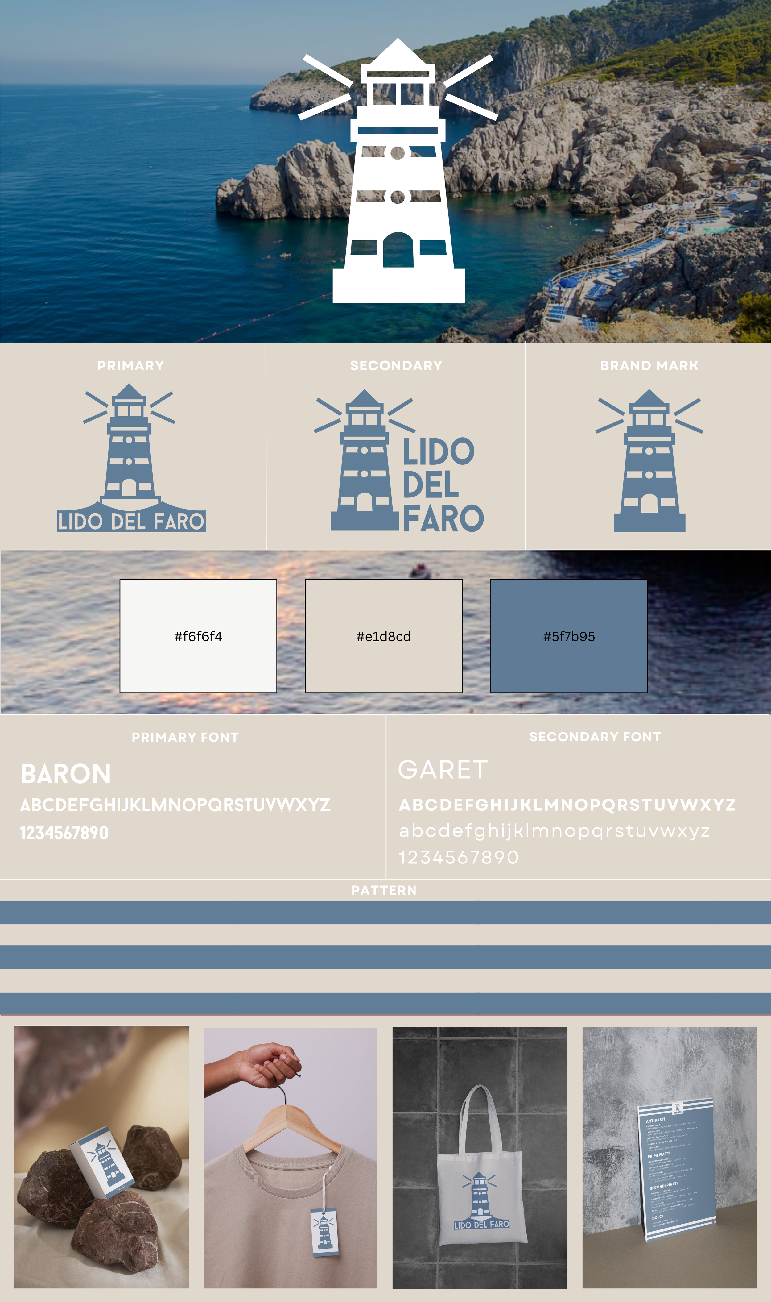
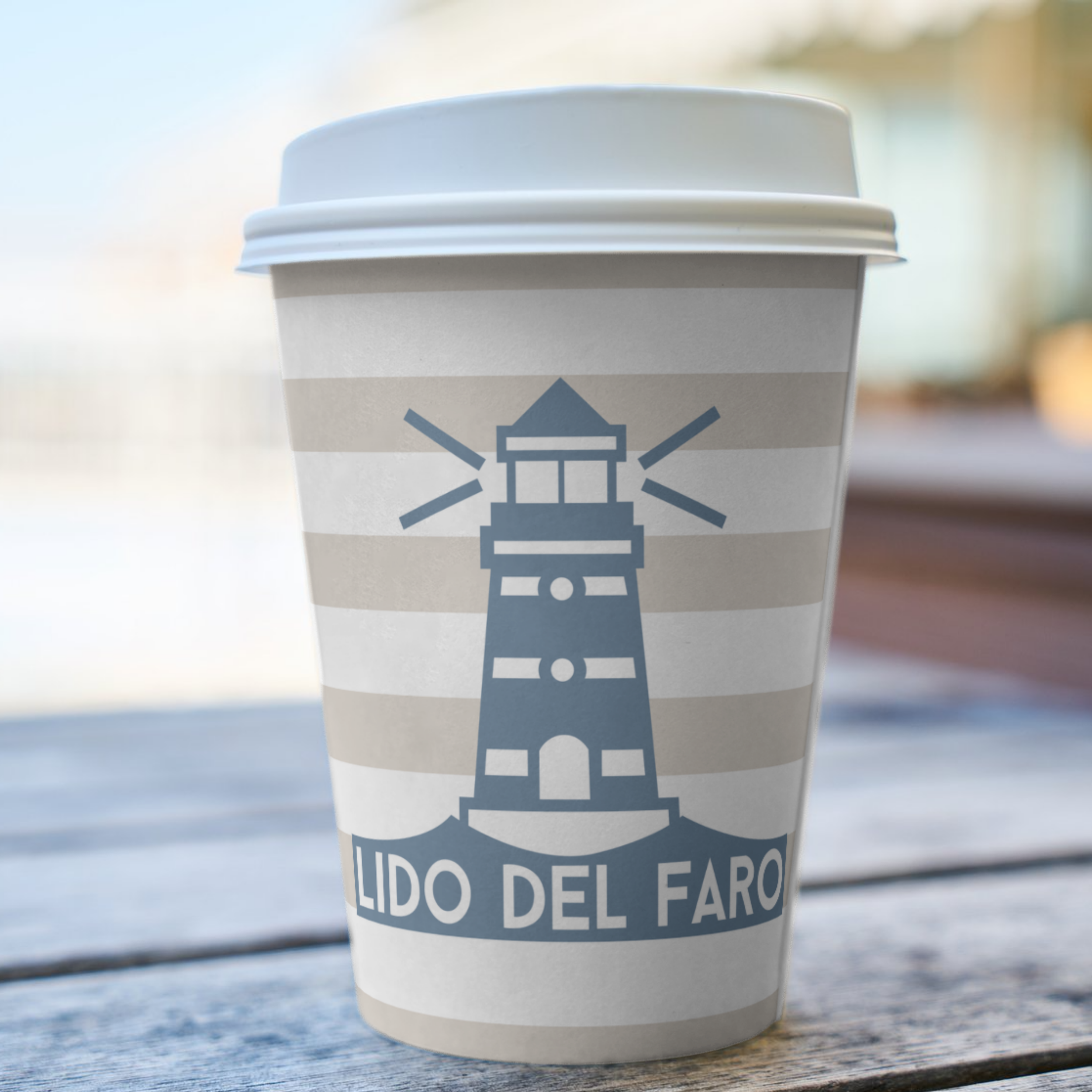
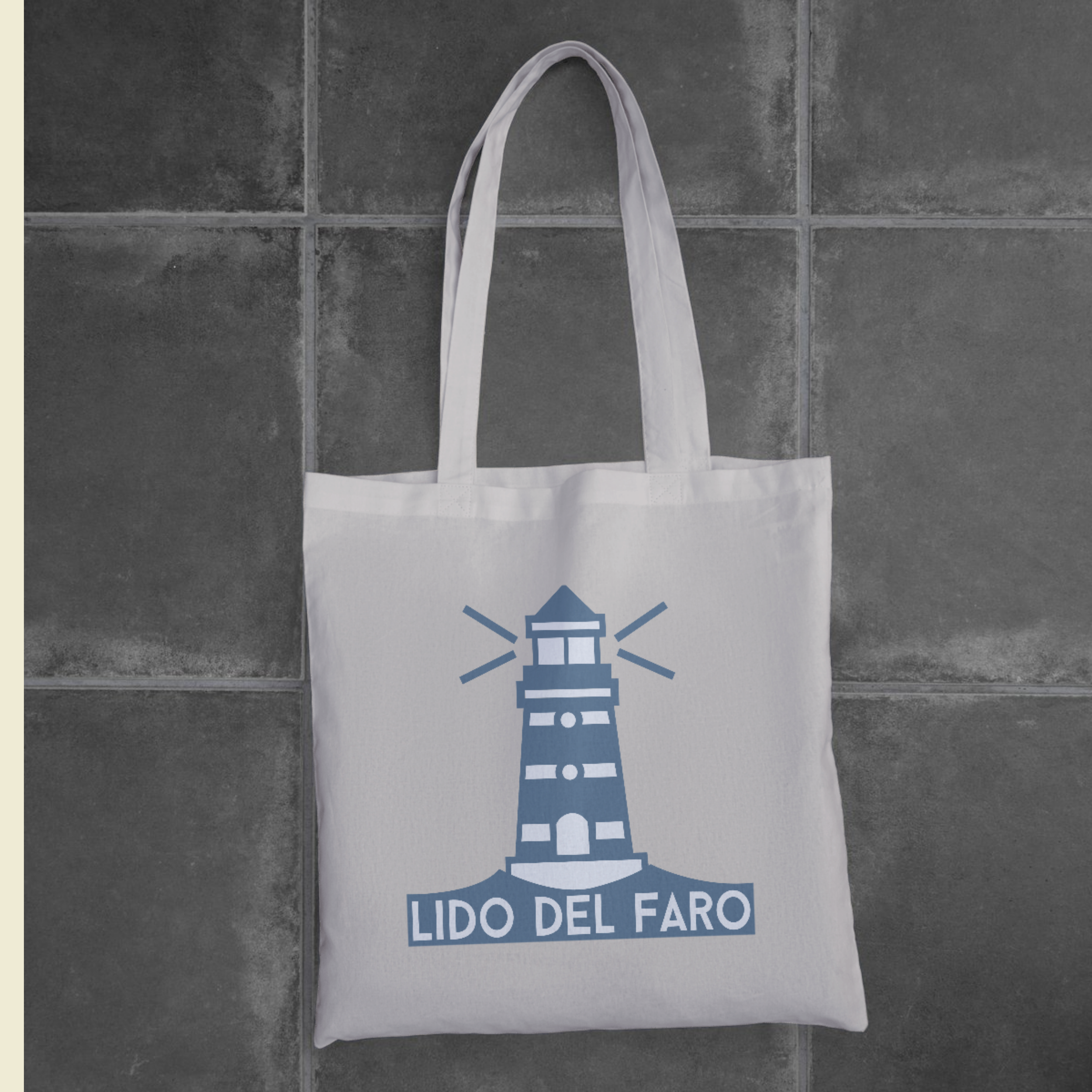
I developed a comprehensive brand redesign package, including new logos, a refined color palette, typography system, brand pattern, and mockups, bringing the refreshed vision to life across every touchpoint.


Before
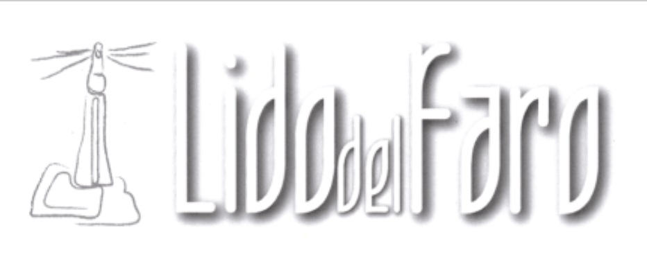
The original logo featured a hand-drawn lighthouse illustration and stylized text, which lacked scalability and visual clarity. The monochromatic grayscale palette and inconsistent typography felt dated, taking away from the allure of the coastal scenery that serves as the core of the brand.
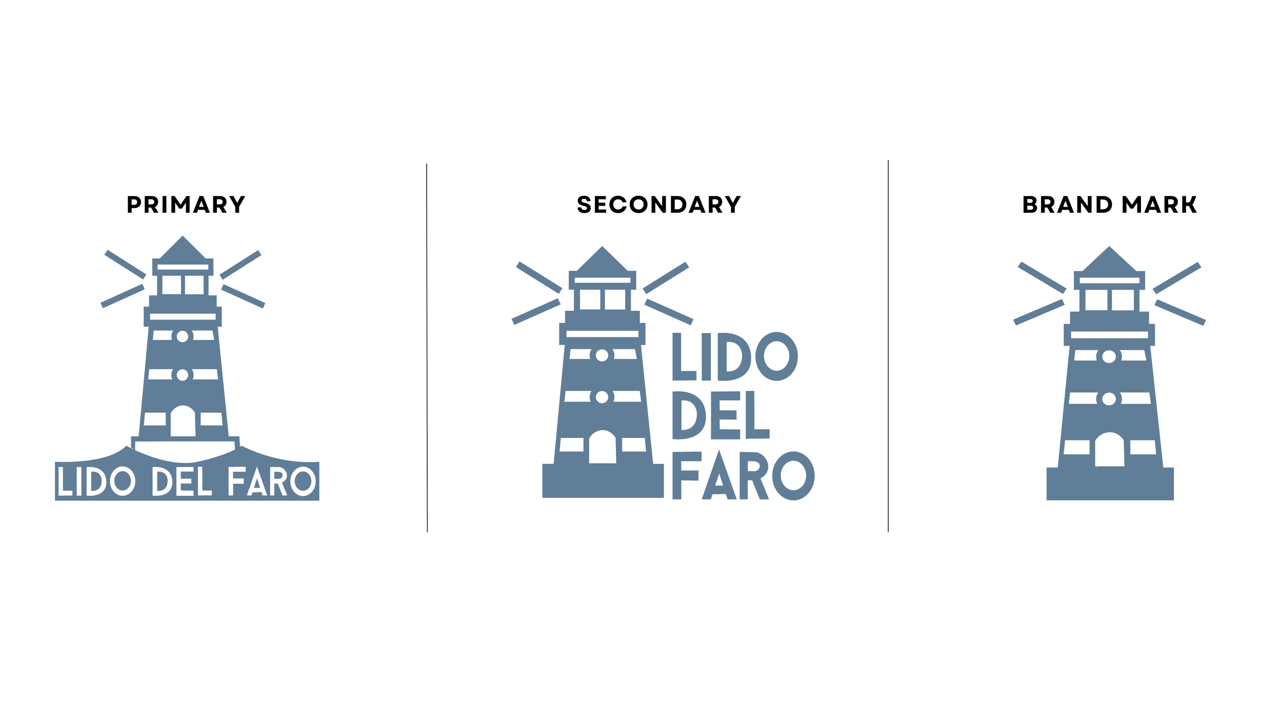
After
The new logo introduces a clean, geometric lighthouse illustration that serves as a powerful and flexible brand icon. Refined typography using the Baron typeface brings a modern yet approachable tone, perfect for signage, menus, and merchandise. The warm, coastal-inspired color palette features a sandy neutral and cool blue, contrasted with white, which can be shifted depending on the logo application.
FINAL PACKAGE
FINAL PACKAGE